Crossrail station design: New video looks at Abbey Wood station
Crossrail have released another video looking at design evolution and thinking behind stations on the Elizabeth Line – and this time it’s Abbey Wood.
This particular station one is intriguing to me as it’s a station I’ve used all my life, and one that presented some challenges as a terminus and interchange constructed around a busy live railway.
It’s also of note as as while the station is excellent in many ways, it also makes some mistakes to someone who used it daily for years – and still does regularly.
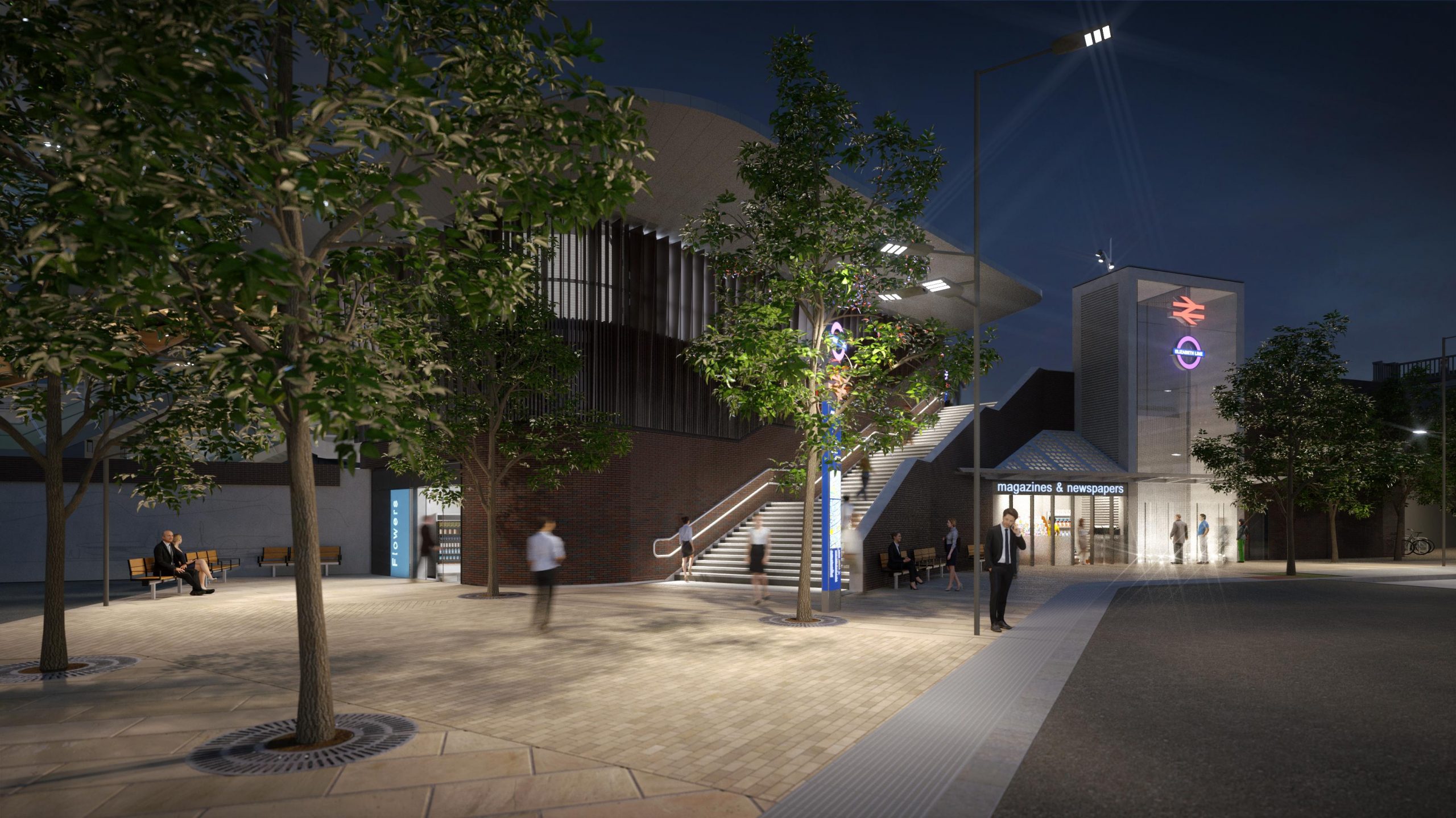
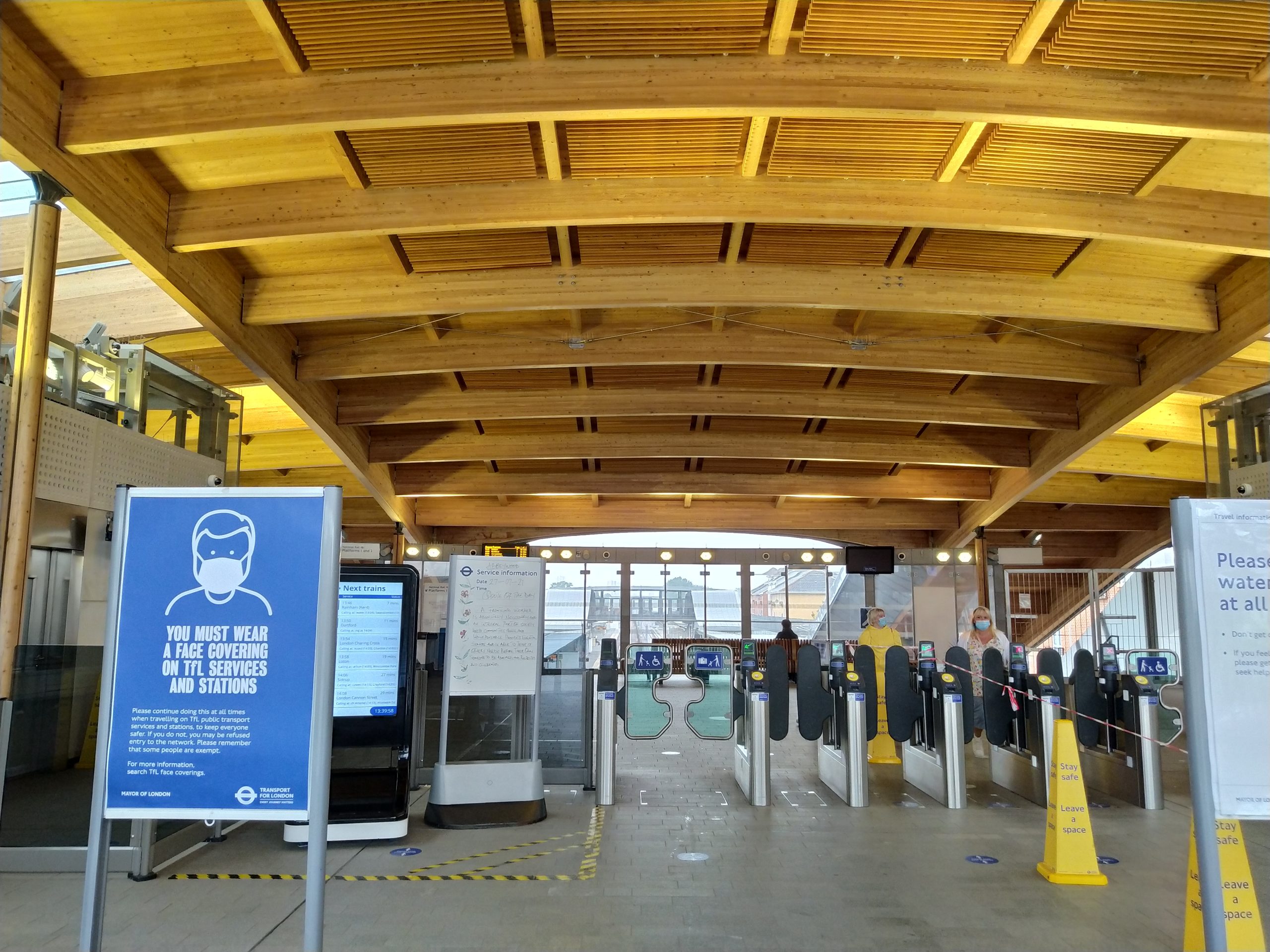
Before we get to that, the video’s a good watch offering insight into design evolution. One idea was bringing greenery into the station which evolved into extensive use of wood in reference to the nearby wood which give the town its name.
Another reference is William Morris who would stop at the station before heading to the Red House house in Bexley.
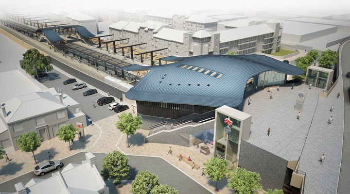
Interchange was a major factor behind the new design as not only is Abbey Wood a very busy station now, it will now become a major interchange point from Kent.
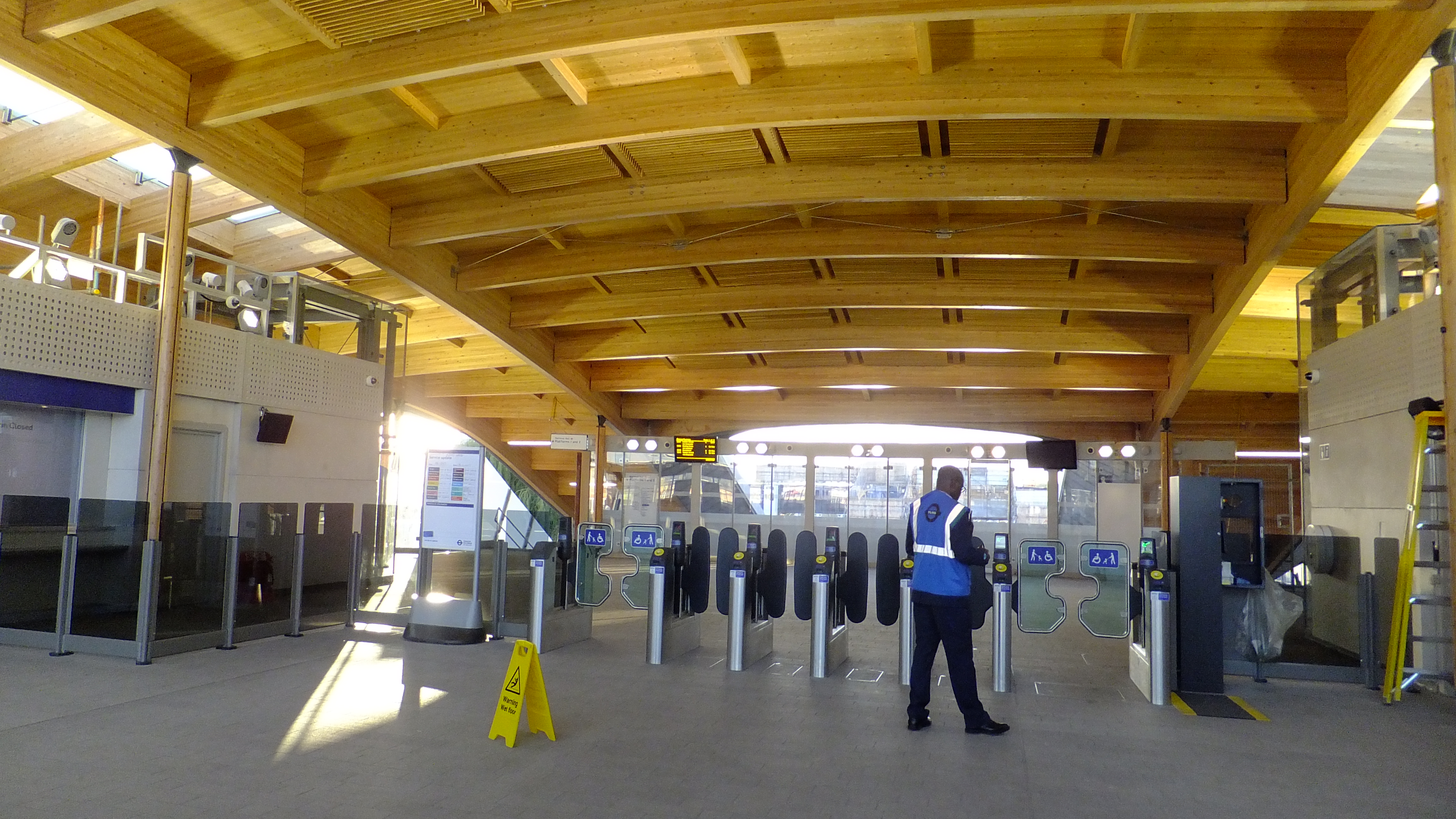
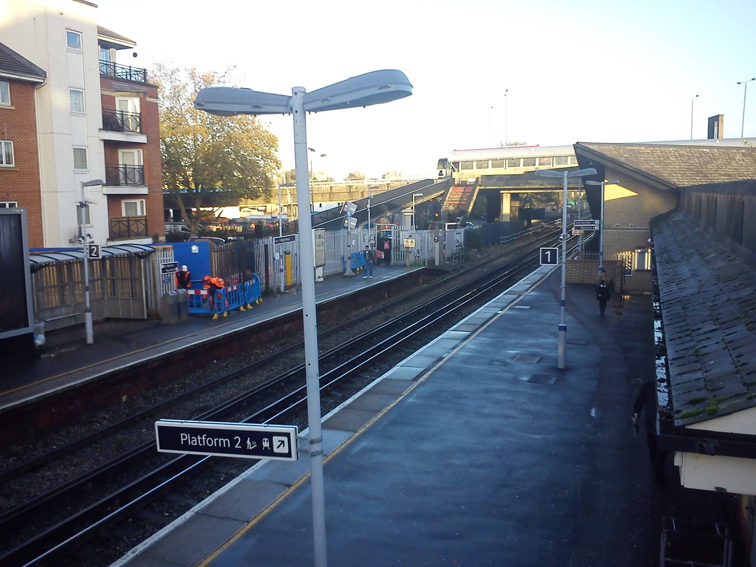
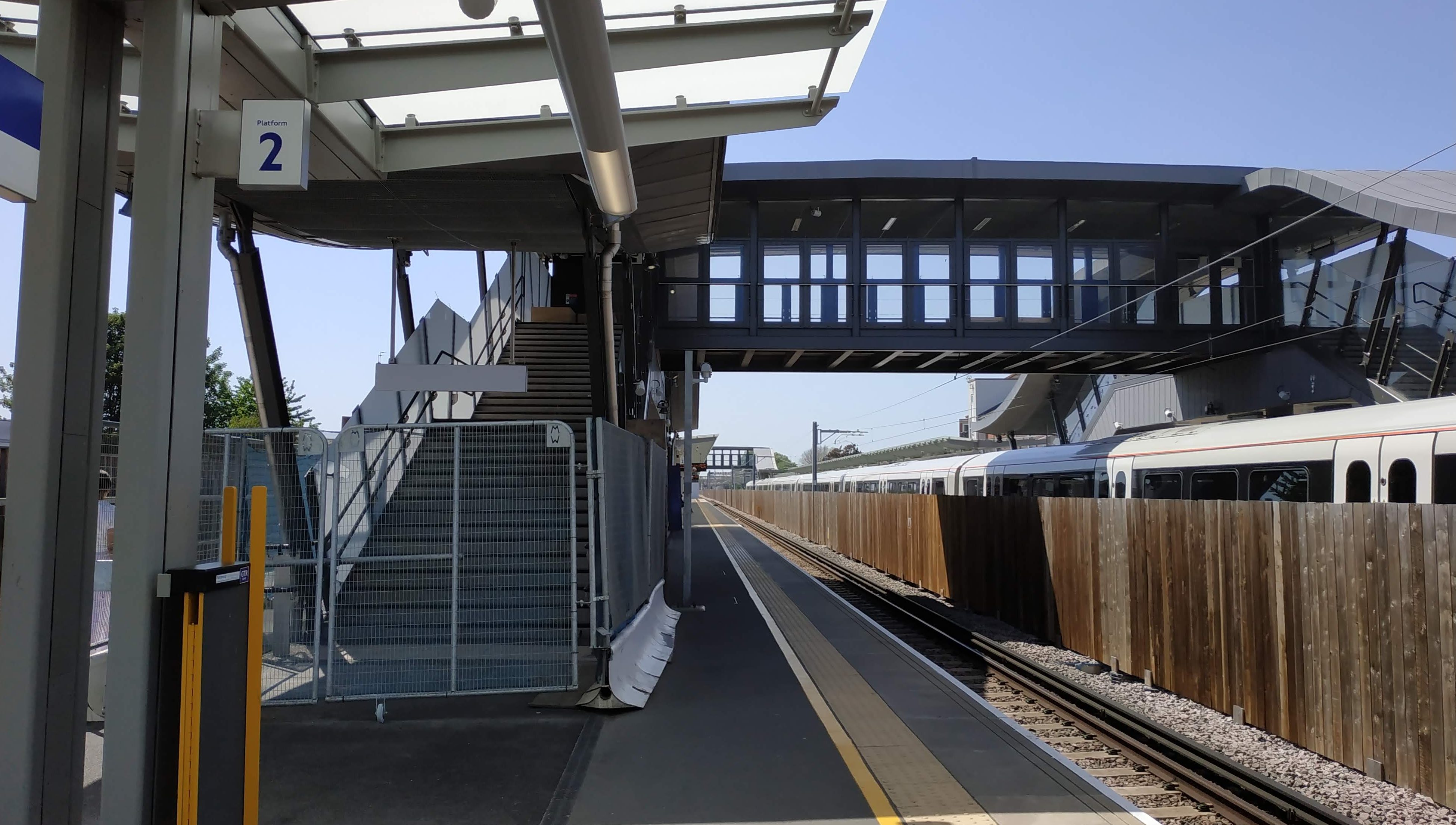
A bridge half way down the platform includes escalators.
A late addition was another footbridge at the far western end of the platform.
Sadly no entrance to the station exists at the western end beside Abbey Wood estate.
Changes
The new station is the third to stand here in under 40 years. A 1849 Victorian station was demolished to make way for replacement in 1987 which was very Network South East. Red was the predominant colour scheme (see second pic here) That’s the one I recall from a young age and it was excellent design. Light, airy and welcoming, and somewhat of a miracle given the financial constraints of British Rail at the time.
Yellow brick was extensively used inside and out and offered a seamless visual link as passengers entered then walked to platforms.
This photo doesn’t do it justice, and is taken just before demolition Southeastern had painted over the vivid red in their corporate colours, with red just about visible:
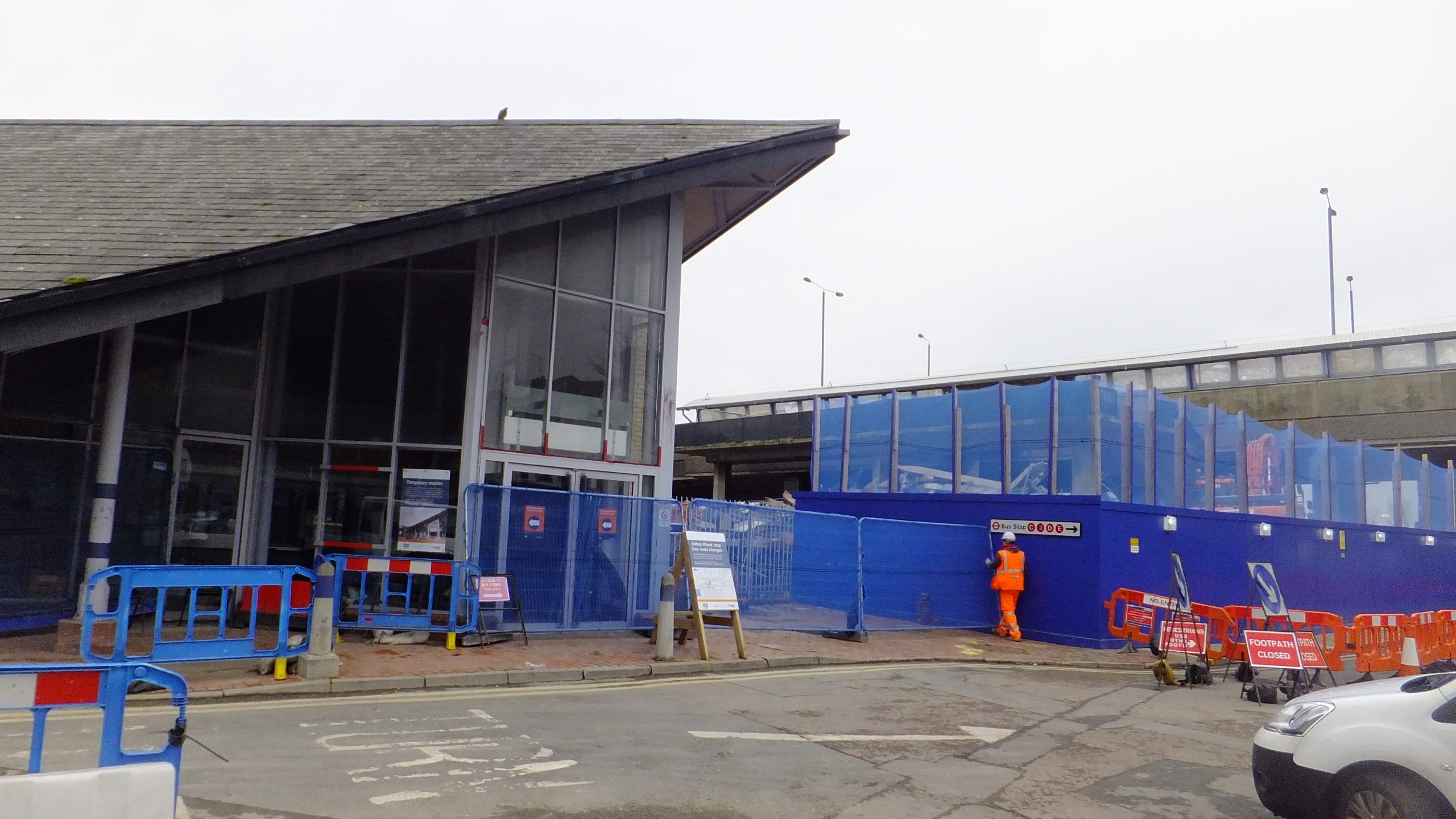
Demolition came in 2015 with many photos of the process visible at Bexley is Bonkers here.
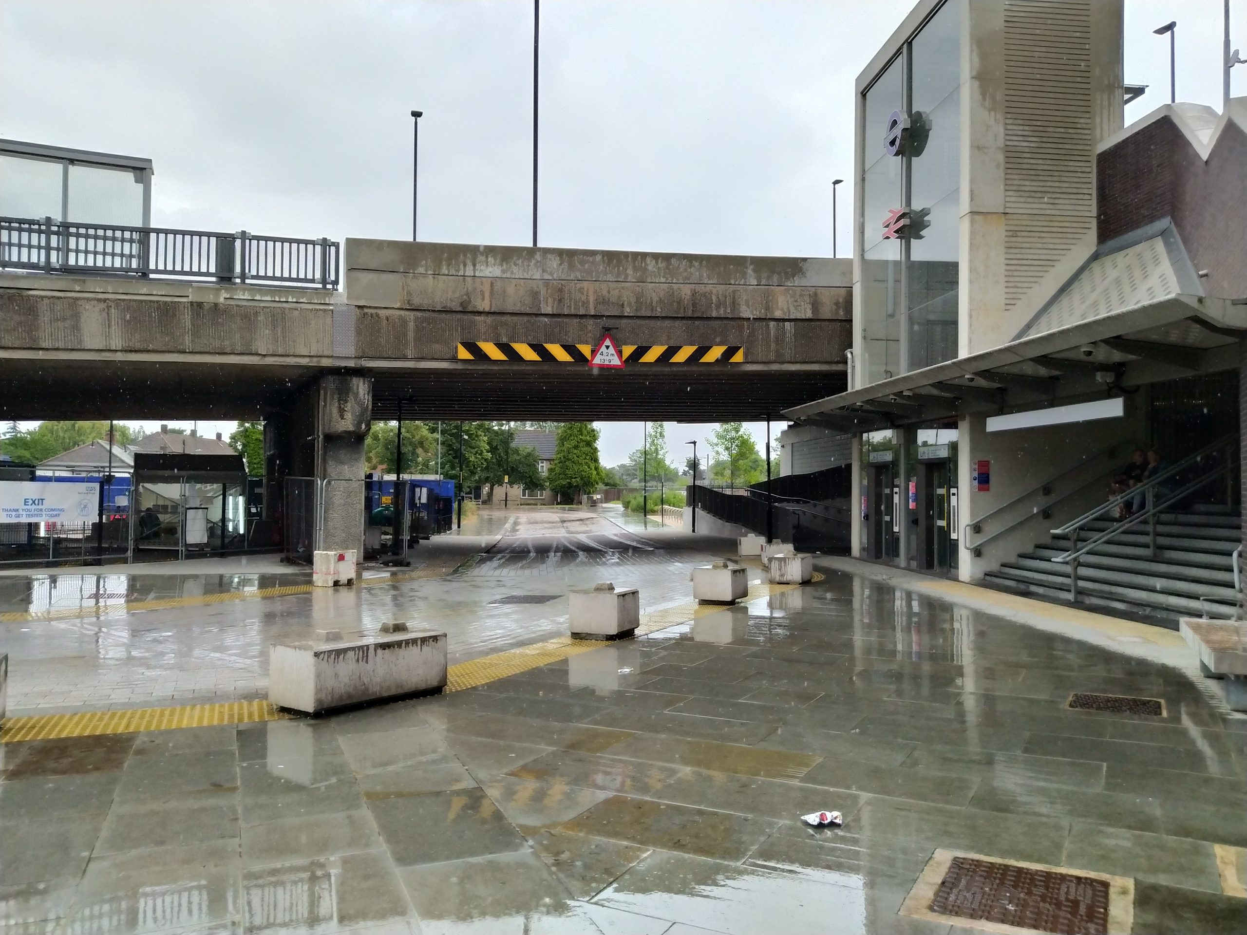
We now get to major design differences between that station and the new. The 1987 design offered an impressive face to the adjacent Wilton Road visible the length of the road with that steeply pitched roof, though arrivals by bus had a less appealing tangle of walkways from the flyover and bus stops beside.
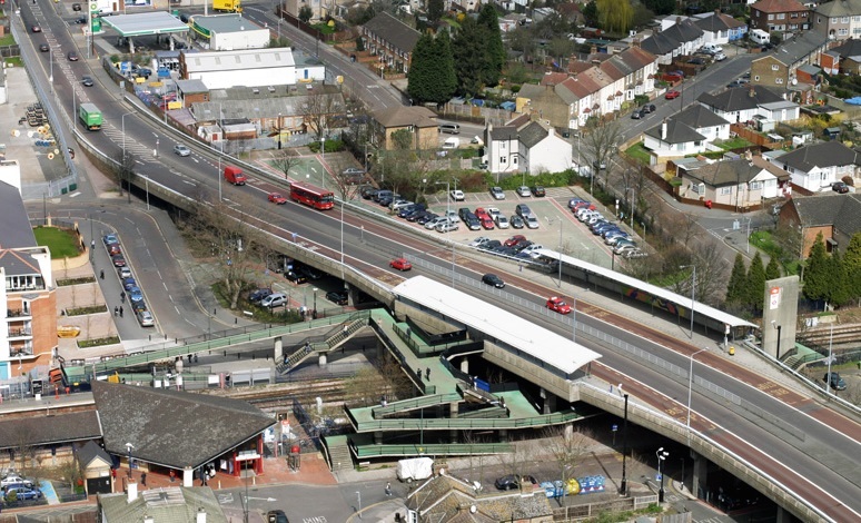
The same applied to people wanting to walk from one side to the other It wasn’t quick or direct. The walkways and flyover replaced a former level crossing.
Where the new station differs is that it places a great deal more emphasis upon those arriving by bus and those traversing over the railway line (which is very much needed) while those arriving on foot at street level are perhaps an afterthought. Street level frontages are dull with much plain brick wall in evidence. This is the northern side:
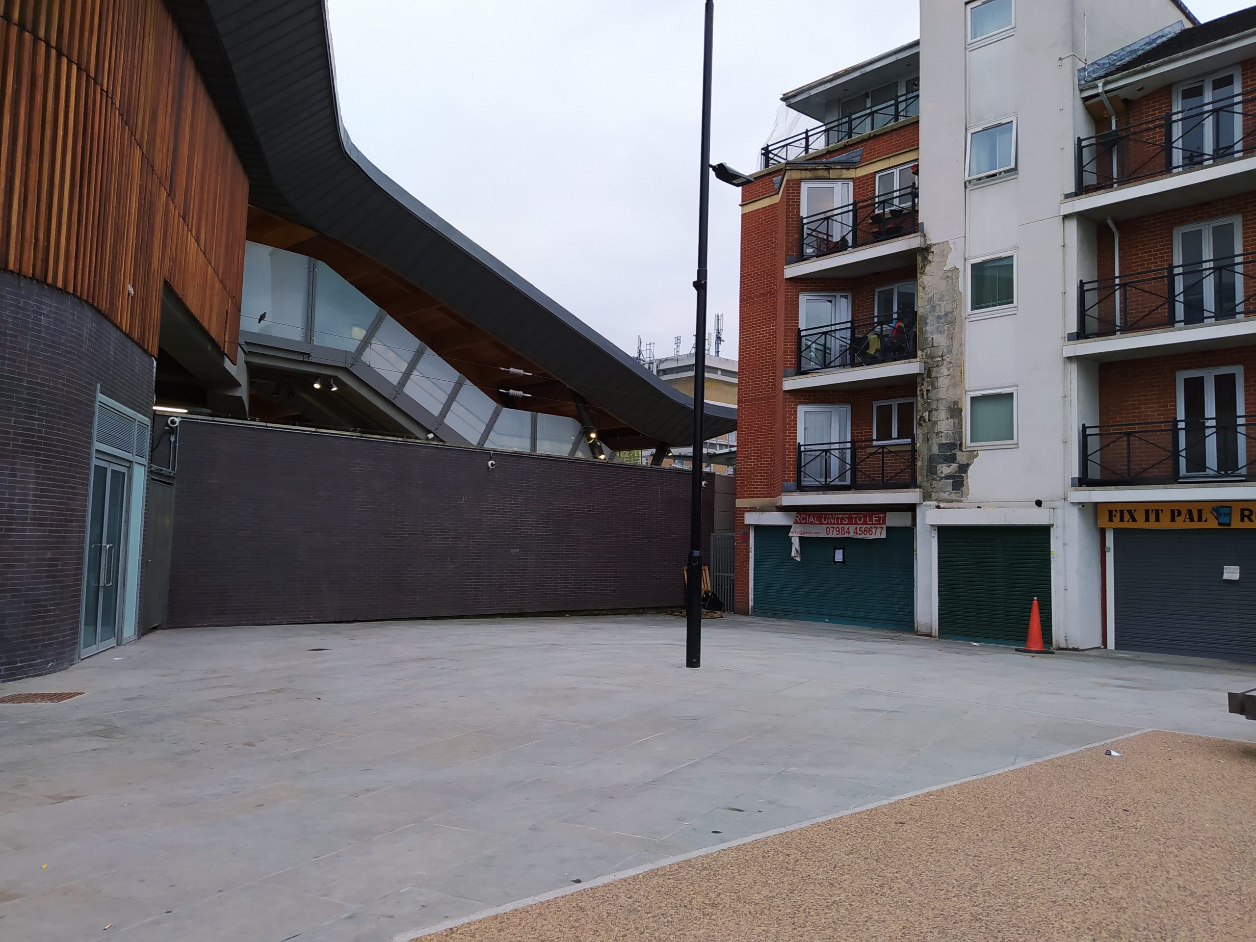
There was space for a commercial unit, mural, decorative feature or, well, anything that isn’t a brown brick wall in that spot above beside shops.
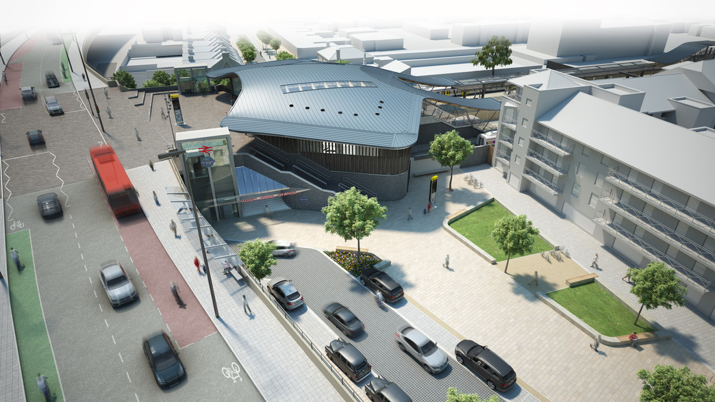
If we look at the 2014 render, a plan wall wasn’t evident but a lighter coloured area with the possibility of a mural.
If we also look back to renders before construction for Wilton Road, it had what appears to be a mural and commercial space.
It’s unclear if there still are commercial spaces. None have opened and I’ve never seen any advertisements.
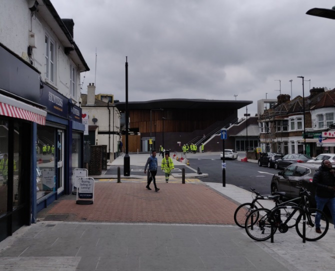
Don’t get me wrong, the Felixstowe Road side was ugly before and better now, it’s just the just the contrast with the top level is noticeable.
Compare the wonderful space inside the station beside the flyover:
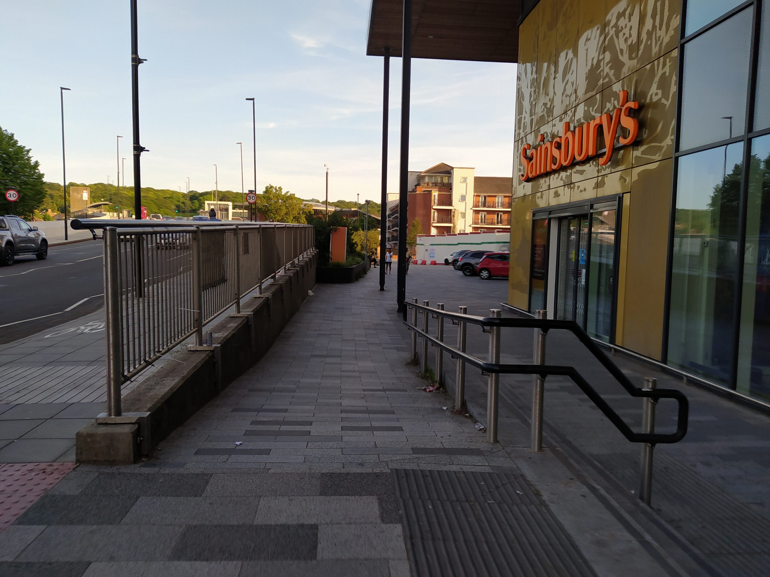
To the entrance and public realm at street level below on Felixstowe Road:
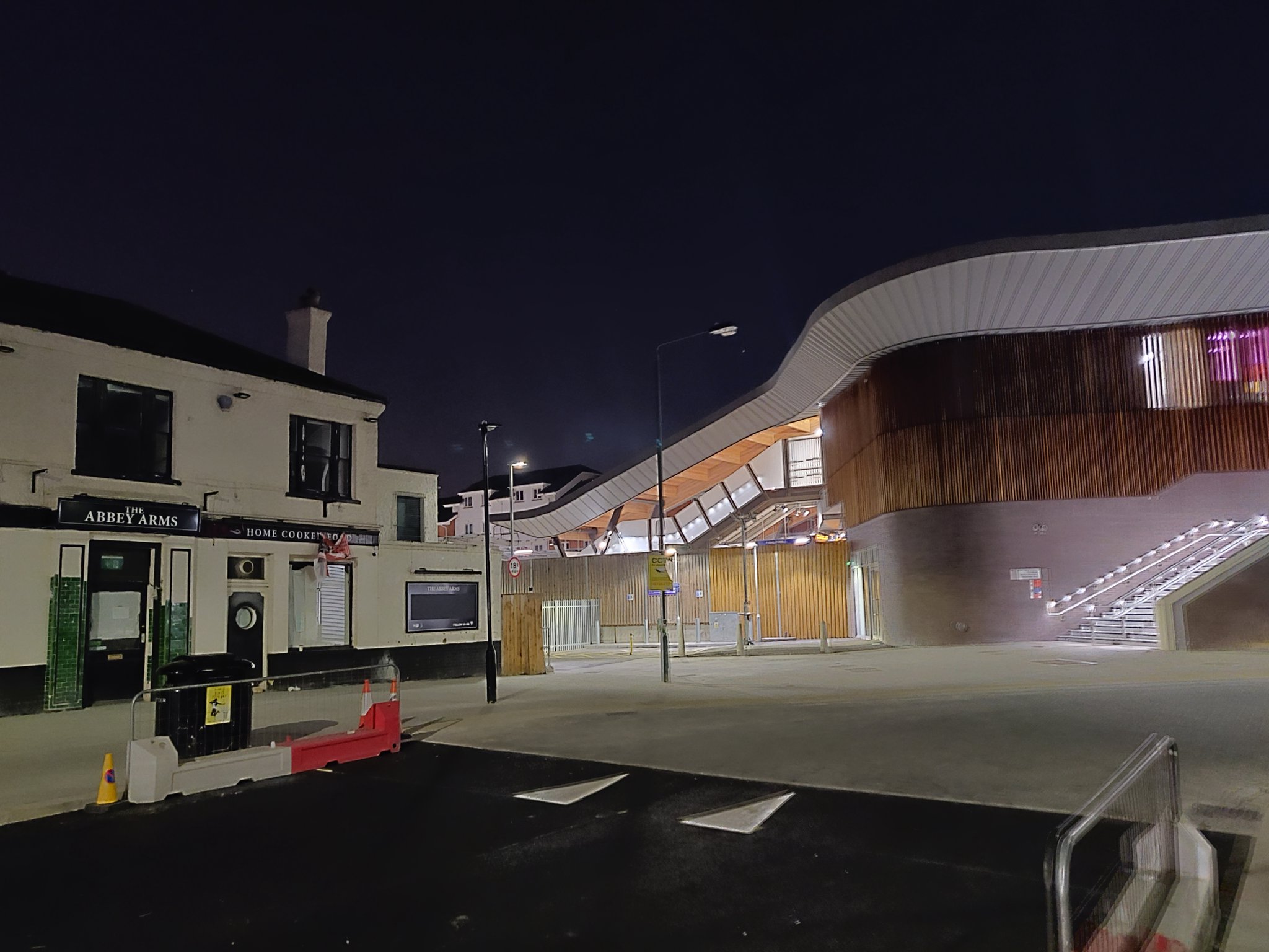
Timber slats above also present a rather drab face to the area.
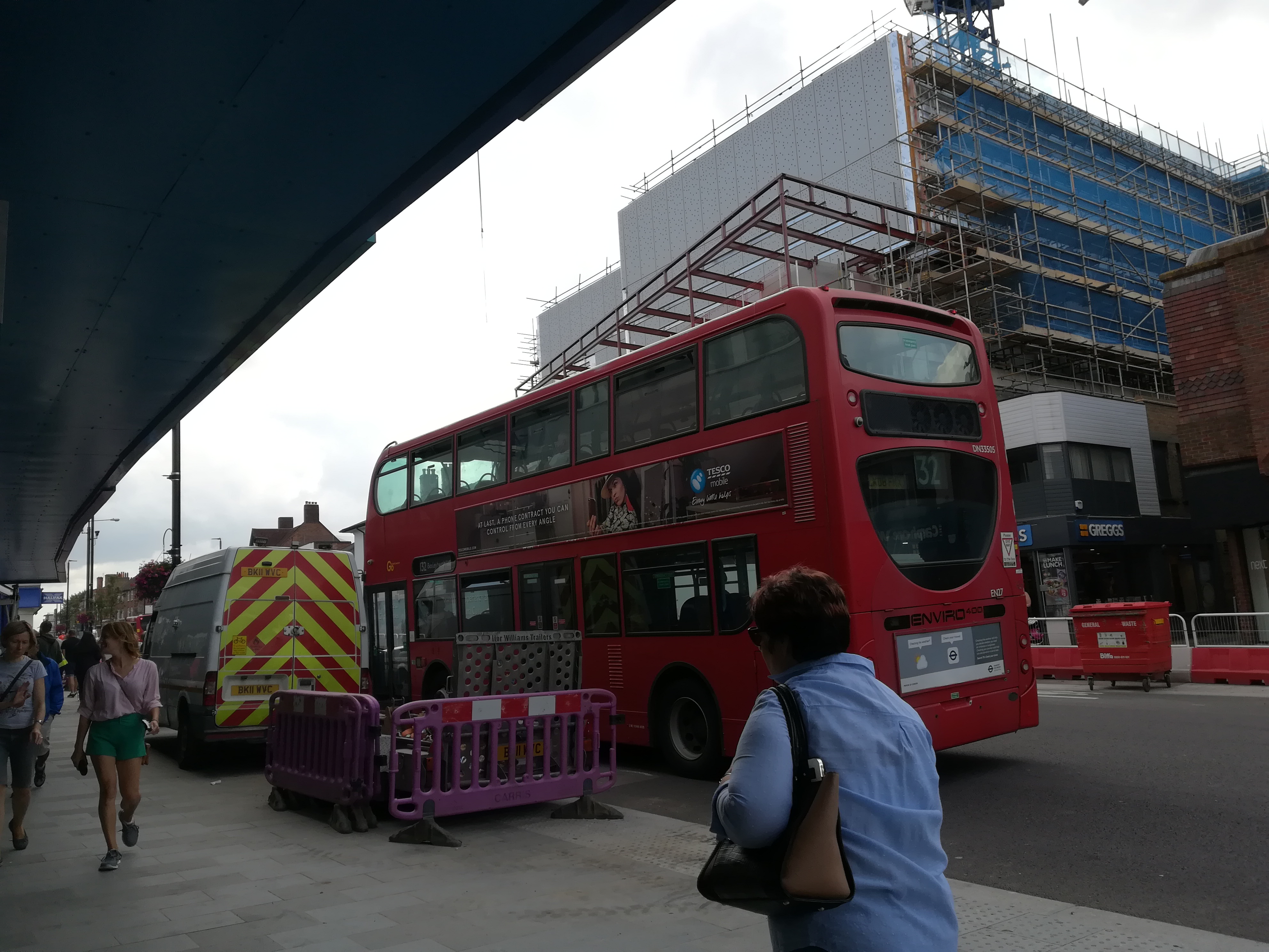
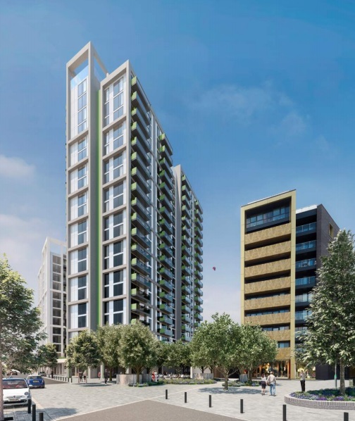
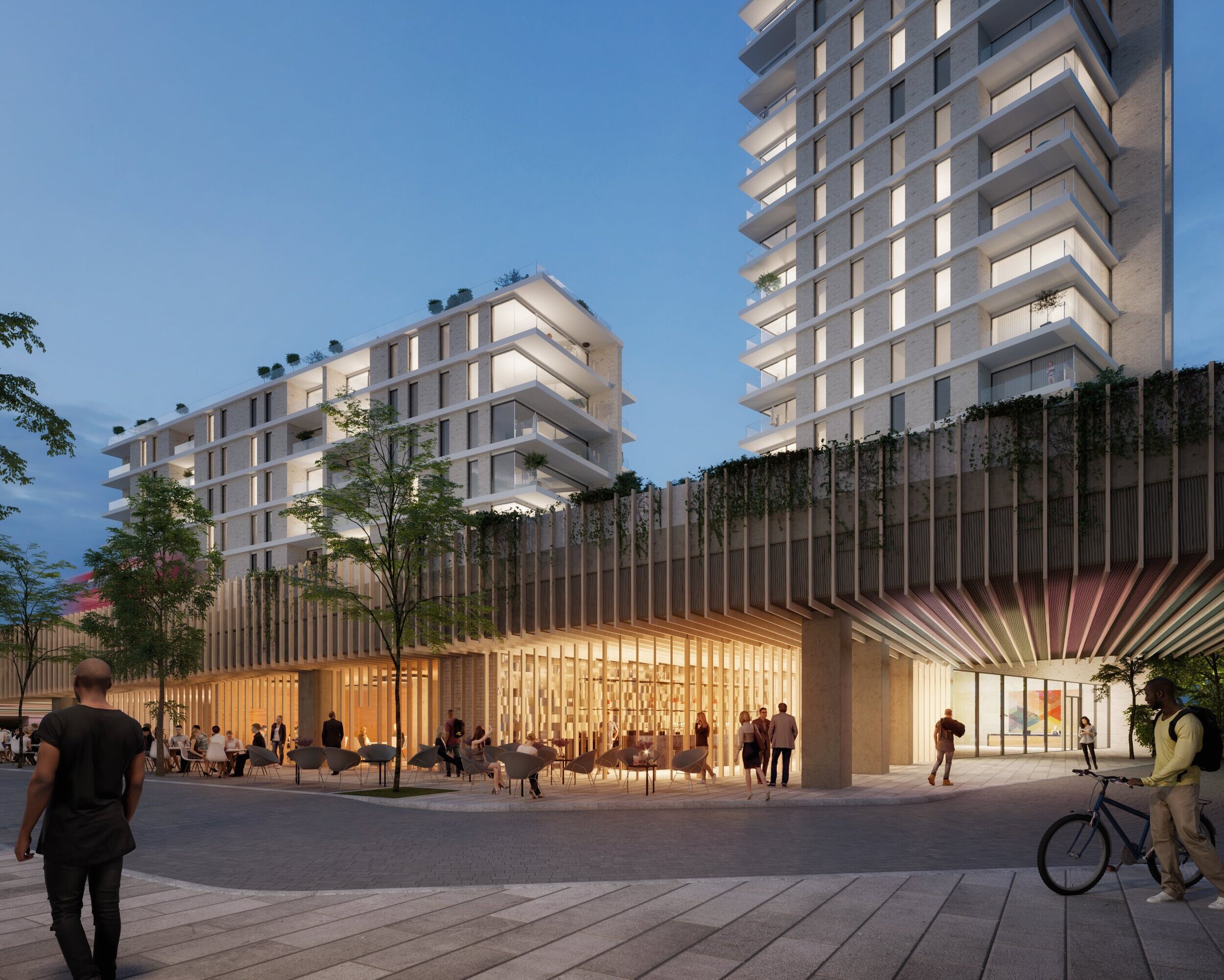
Anyone who used the station knows footfall on either side of the station is far from non-existent, and will only increase. Firstly, two towers are now underway a short walk away to the east. Around a minute on foot:
Then there’s thousands of homes Peabody will one day build along Harrow Manorway. Many future residents walking to the station will cut down beside Sainsbury’s to reach the Felixstowe Road entrance, as the alternative is to walk up the flyover and its incline.
There’s other developments planned which will see future passengers possibly use the street level entrance, such as Bexley Council’s plan for 300 homes on the current car park at Felixstowe Road:
Not forgetting homes planned at the junction of Harrow Manorway and Eynsham Drive:

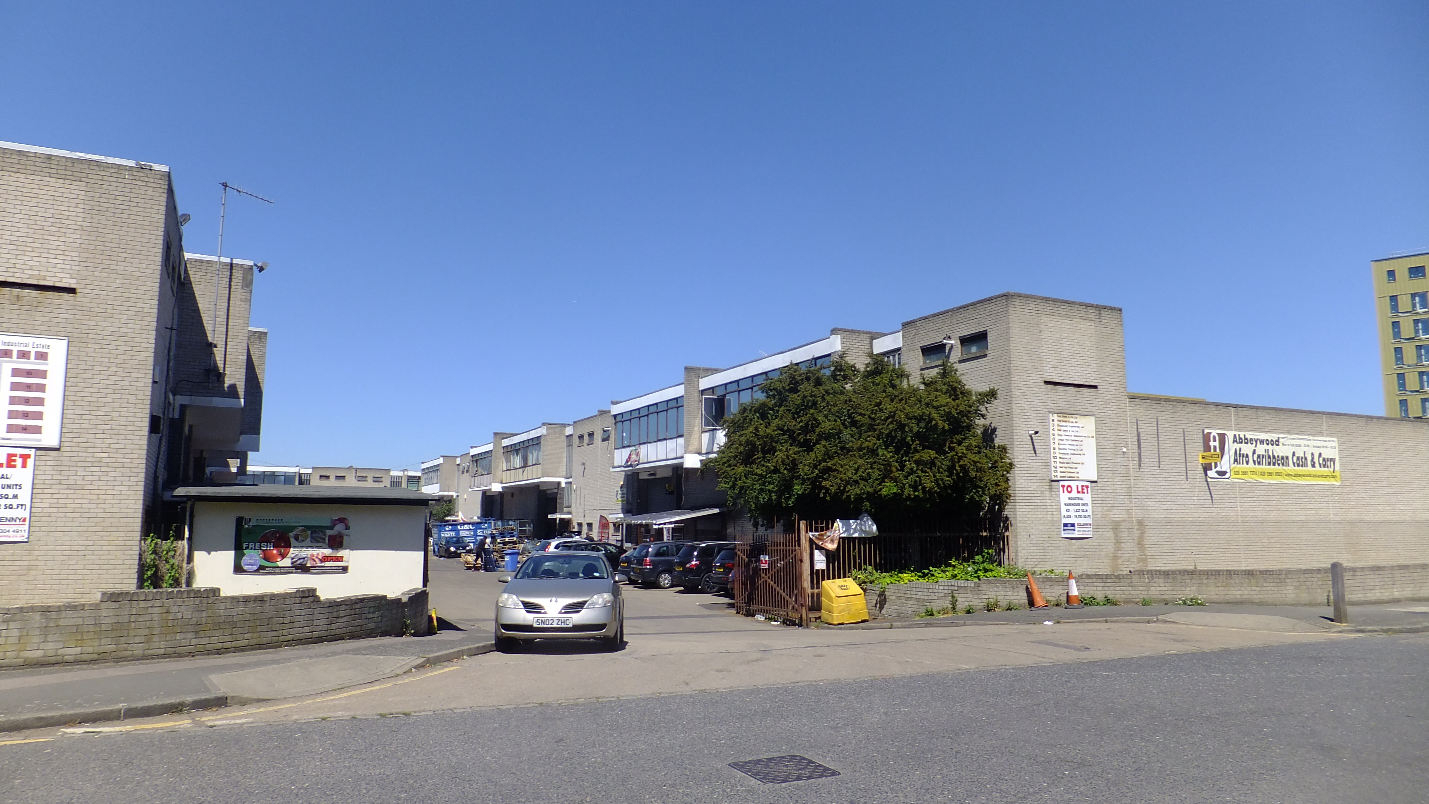
And up to 600 homes at an industrial estate beside two towers now rising on Felixstowe Road:
The face which the station presents to all those future residents isn’t particularly appealing or attractive. It’s not aging too well either. The concrete lift shafts and canopy already look tired.
However that can be improved as new developments come along such as BexleyCo’s 300 homes. It wouldn’t take much for some artwork to improve the space, for example. Promised greenery still isn’t in place on either side.
Landscaping and public realm can improve some of the deficiencies of the station if the drive is there to do it.
Ultimately we have a great station in parts, brilliantly constructed around a live railway and offering many great improvements. The downsides are apparent cut-backs at street level with not very active and drab frontages for those in Abbey Wood. A station for those arriving from afar rather than those that live in the area.
A missed opportunity perhaps then to create an all-round great new piece of design, and one that can hopefully be rectified with low cost interventions such as artwork and lighting in future.
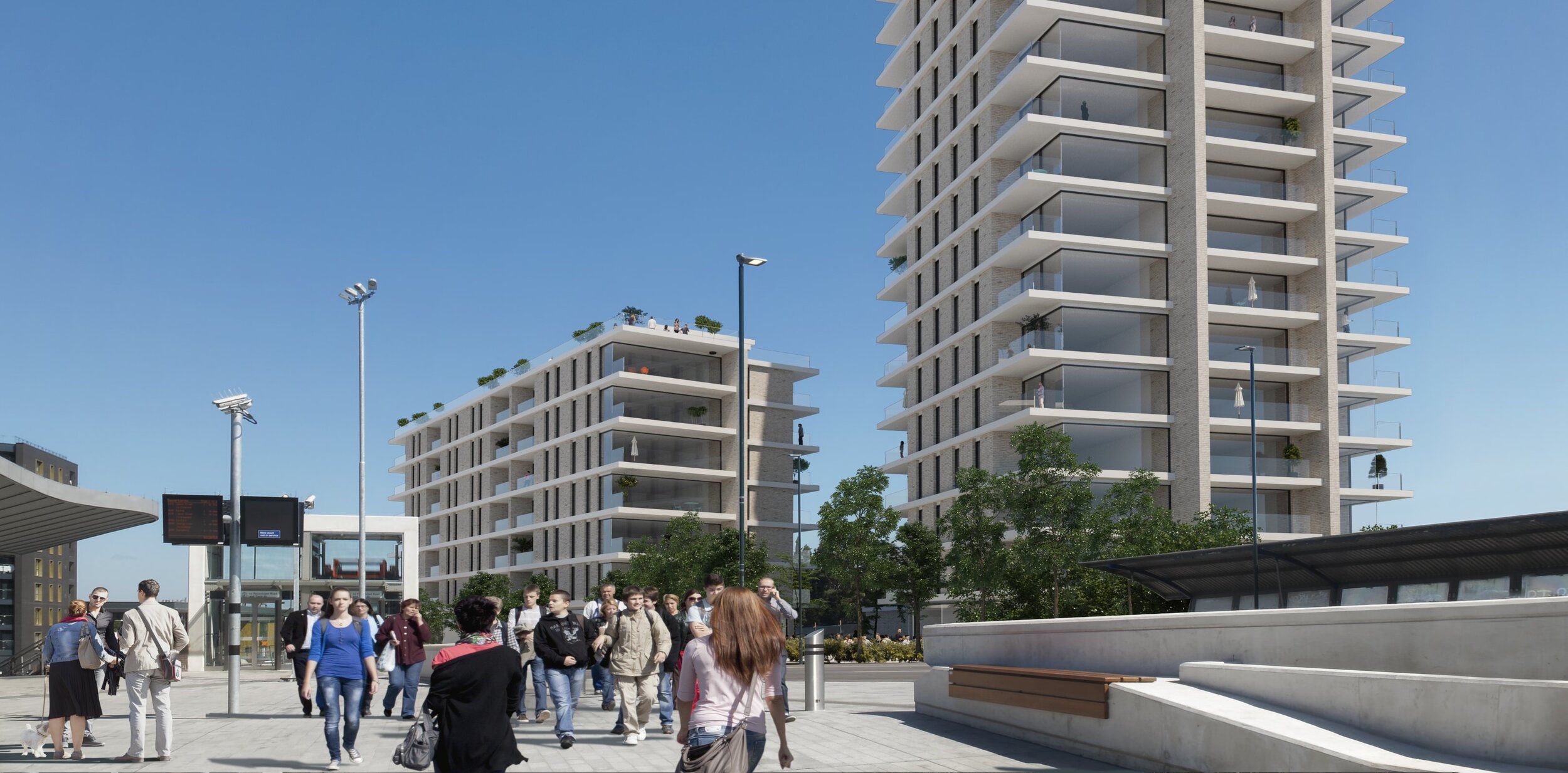
BexleyCo’s tower may do this with renders showing commercial units:
However if we know one thing about early visuals, it’s we can hardly trust them. Fingers crossed.