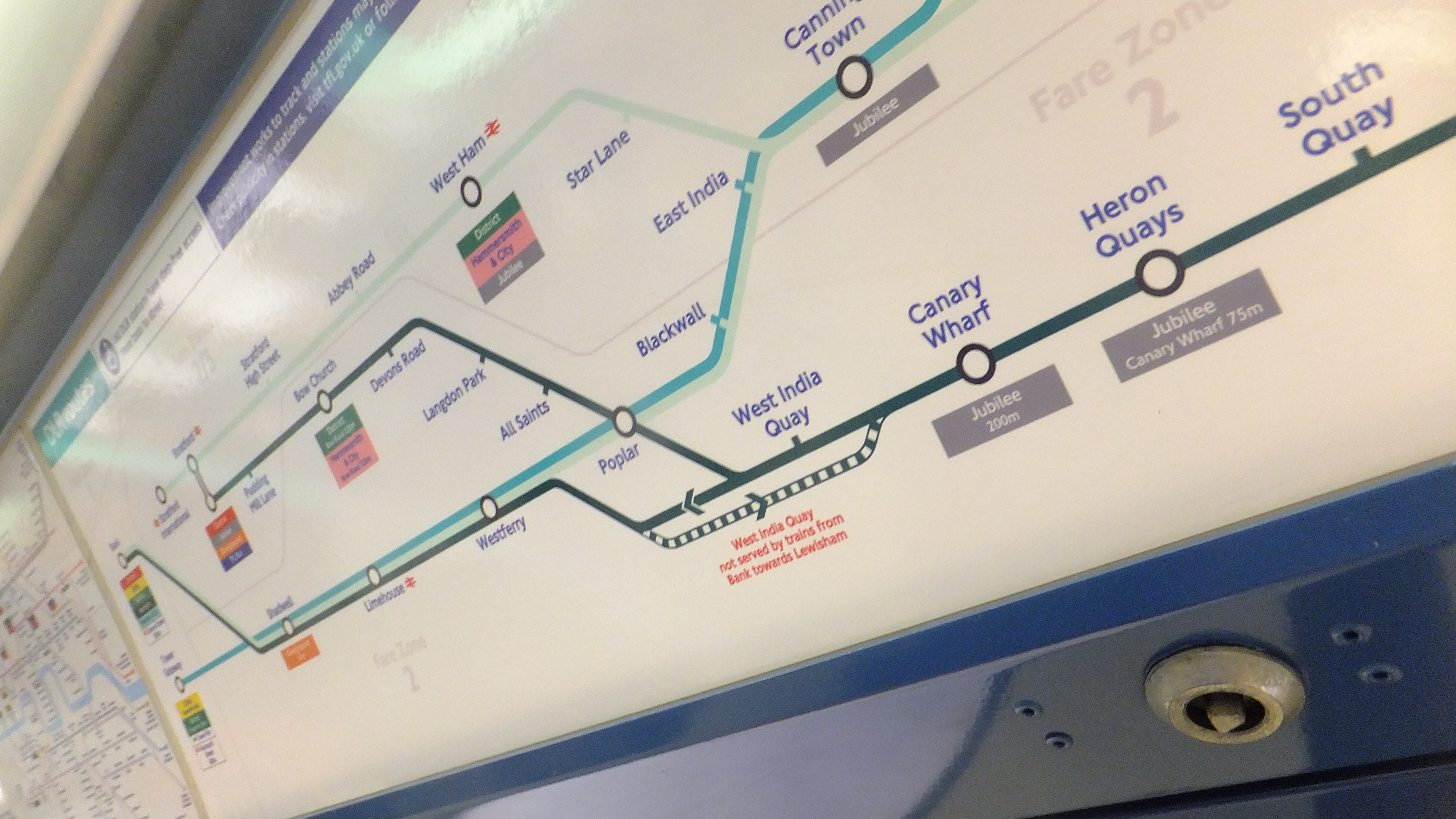
The DLR gets a new map – each route now separated by colour
Transport for London are rolling out a new map for the DLR which separates routes by different shades. This is the first big change in the 30 year history of the DLR. Many have called for greater separation of routes as the network has expanded.
Will the London Overground be next up? Its maps have became a bit of a tangled mess as the network expanded. As well as colour changes could names be altered eg LO 1, LO 2. Will the DLR get that?

In other news TfL are looking into the future of London Overground ticket offices. If gateline staff are also removed its a false economy as fare evasion will increase.
Southeastern is already that way. Over the weekend I travelled on four suburban lines through many busy stations on some convoluted journeys (Hint: don’t always follow journey planners). Almost no stations were staffed or had ticket barriers in operation. God knows how much revenue is going missing and how many passengers aren’t being counted.
It’s a big contrast to c2c which I recently used. Despite being only two trains an hour due to engineering work, most stations had staff and barriers on a Sunday. As well as more staff, c2c in London use the TfL fare scale and passengers aren’t charged £1.50 extra for switching to the tube as Southeastern passengers are.


The DLR service kicked off in 1987 with two colour coded routes.
https://www.flickr.com/photos/dgeezer/1292767158
Things have got rather more complicated since!
I have my doubts that a “really faint green” is the way to go.
Blimey I never knew that. My first use was in the early 90s.
I don’t like this DLR map at all. Over the past few years I have submitted alternative designs to them all of which have generated no or little interest. The last one I designed can be seen here and shows they could at least have chosen much better colours for the routes:
https://www.dropbox.com/s/rpzvk564z389jma/DLR-H2Ds.pdf?dl=0
https://www.dropbox.com/s/w8jag2ls8pva17t/DLR-H2Ds_.pdf?dl=0